จะแสดงผลข้อมูลที่ซับซ้อนให้สามารถเข้าถึงได้ (Accessible) ได้อย่างไร
เป็นที่รู้กันว่า Data Visualization เป็นหนึ่งในเครื่องมือที่ช่วยให้เราสื่อสารข้อมูลที่ซับซ้อนและยุ่งเหยิงให้กับผู้รับสาร โดยการใช้ทัศนธาตุ (Visual Elements) ที่อยู่ในแผนภูมิ แผนภาพ หรือ แผนที่ ซึ่งช่วยให้สามารถทำความเข้าใจข้อมูลได้อย่างง่ายและรวดเร็ว (ตัวอย่างเช่น Visual Analytics การวิเคราะห์ด้วยภาพ) อย่างไรก็ตาม ในบางครั้ง Data Visualization ที่ถูกสร้างขึ้นมาก็อาจจะเข้าถึงไม่ได้สำหรับผู้รับสารทุกคน โดยเฉพาะผู้พิการหรือคนที่ดูผ่านอุปกรณ์ขนาดเล็ก เรียกได้ว่ามีอุปสรรคในการเข้าถึง (Accessible Barrier) สำหรับคนกลุ่มนี้
ใครบ้างที่ต้องอาศัย Accessibility
WRC ได้อธิบาย Accessibility ไว้ว่า หมายถึงการที่สิ่งที่เราพัฒนานั้นสามารถถูกใช้งานได้อย่างครบครันโดยคนพิการ เช่น
- ทางการได้ยิน เช่น หูตึง หูหนวก
- ทางสติปัญญา เช่น สมาธิสั้น
- ทางประสาท เช่น ลมชัก (อาจถูกกระตุ้นโดยปัจจัย เช่น แสงกะพริบ)
- ทางกายภาพ เช่น แขนพิการ
- ทางการพูด เช่น ลิ้นไก่สั้น เป็นใบ้
- ทางการมองเห็น เช่น ตาบอด (ใช้ Text Reader ในการอ่านข้อความแทน) ตาบอดสี
นอกจากผู้พิการแล้ว Accessibility ยังเป็นประโยชน์กับคนกลุ่มอื่น เช่น
- ผู้ที่ใช้ Smart Phone อุปกรณ์ขนาดเล็ก อุปกรณ์ที่ไม่มีแป้นพิมพ์หรือเมาส์
- คนชรา
- คนที่ พิการชั่วคราว เช่น แขนหัก แว่นสายตาหาย
- คนที่เจอกับ สถานการณ์ที่ทำให้มีข้อจำกัด เช่น อยู่ที่ที่แสงจ้า หรือ ขณะนั้นไม่สามารถเปิดเสียงได้
- คนที่อินเทอร์เน็ตช้า หรือ จำกัด Bandwidth
ตัวอย่าง Accessible Barrier
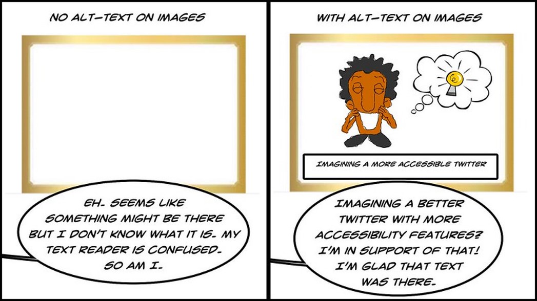
- เน้นใช้รูปภาพหรือแอนิเมชัน โดยไม่ได้คำนึงถึงกลุ่มคนที่ใช้ Text Reader
- การเลือกใช้ชุดสีที่ไม่เหมาะกับคนตาบอดสีหรือมีปัญหาด้านการมองเห็น
- ใช้องค์ประกอบที่อาศัยการโต้ตอบได้ (Interactive) ผ่าน Keyboard อาจจะเป็นปัญหาสำหรับผู้ใช้ที่พิมพ์ได้ลำบาก
- Visualization มีขนาดที่ไม่เหมาะสม เช่น ตัวอักษรขนาดเล็ก
การทำให้ Data Visualization นั้น Accessible จึงแปลว่าการให้ผู้รับสารทุกคนสามารถเข้าถึงสิ่งที่เราต้องการจะนำเสนอโดยไม่พลาดอะไรไปเพราะข้อจำกัดต่าง ๆ

การสื่อสารข้อมูลให้ Accessible
ในการสื่อสารข้อมูลนั้น เราจะต้องสื่อให้ผู้รับสารสามารถทำความเข้าใจข้อมูลได้ทั้งจากในบริบทของ Visualization เอง และจากทางเลือกอื่น ๆ ที่นำมาใช้ทดแทน Visualization ได้ในกรณีที่ผู้รับสารไม่สามารถเข้าใจ Visualization ซึ่งเราสามารถใช้
- หัวข้อ และ คำอธิบาย
- Alternative Text
- Label
หัวข้อ และ คำอธิบาย
อย่าลืมใส่หัวข้อ (Title) และคำอธิบาย (Text Description) เพื่อให้ผู้ใช้ทราบถึงวัตถุประสงค์ของ Visualization และ เมื่ออ่าน Visualization แล้วน่าจะได้ความรู้หรือข้อมูลอะไร
Alternative text
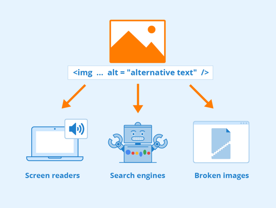
ผู้อ่านบางท่านอาจจะใช้ Text Reader ซึ่งอาจจะต้องทราบว่าเขากำลังเจอกับ Visualization อะไรอยู่
Alternative text ควรประกอบด้วย
- ประเภทของ Visualization
- ประเภทของข้อมูล
- คำอธิบายสั้น ๆ ว่า Visualization จะสื่ออะไร
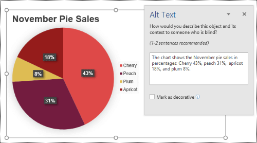
ปกติแล้ว Alternative Text มักจะฝังอยู่ใน HTML tag สำหรับเว็บไซต์ที่ Text Reader จะสามารถอ่านได้ และหากอินเทอร์เนตช้าผู้อ่านก็จะสามารถเห็นข้อความนี้แทนรูปภาพได้ นอกจากนี้ยังมีประโยชน์กับ Search Engine ในการค้นหารูปภาพอีกด้วย
Label
ควร Label ข้อมูลโดยตรง แทนที่จะใช้ Legend แยกต่างหาก ซึ่งจะช่วยให้ผู้อ่านที่ไม่สามารถใช้สีได้สามารถเข้าใจได้ด้วย และยังให้ผู้อ่านเข้าใจข้อมูลได้เร็วขึ้นโดยไม่ต้องกรอกตาไปมาระหว่างแผนภาพและ Legend
การใช้สีและลวดลายให้ Accessible
ตาม Guideline ของ Web Content Accessibility Guidelines (WCAG 2.0) สีที่ใช้ควรมี Contrast ที่เหมาะสม และไม่ควรเป็นองค์ประกอบเพียงอย่างเดียวที่ใช้ในการสื่อสารข้อมูล
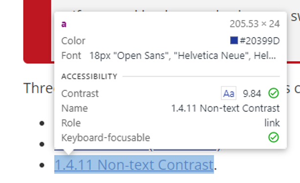
Contrast
สีที่ใช้ควรมี Contrast ที่เหมาะสม ตาม WCAG 2.0 AA or AAA color contrast accessibility standards รวมถึงสำหรับคนตาบอดสีด้วย (อ่านเพิ่มเติมได้ใน Data Visualization สำหรับคนตาบอดสี (Color-Blind))
- ตรวจสอบ Contrast เช่น โดยใช้ Inspection Tool ของ Web Browser สำหรับ Text Element ใน Website หรือ WebAIM: Contrast Checker ในการเทียบสี
- ใช้เครื่องมืออย่าง Color Safe – accessible web color combinations มาช่วยในการออกแบบ
- ใช้เครื่องมืออย่าง Coblis — Color Blindness Simulator ในการจำลองสิ่งที่คนตาบอดสีเห็น
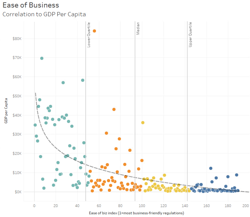
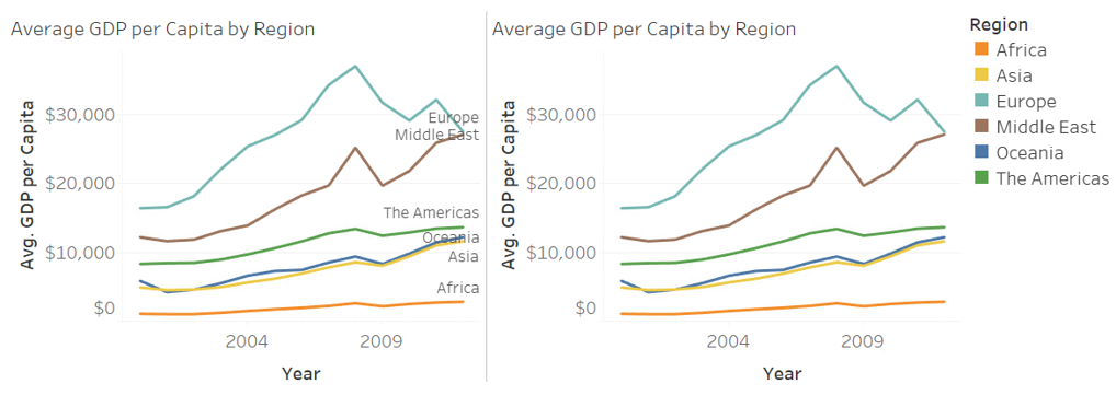
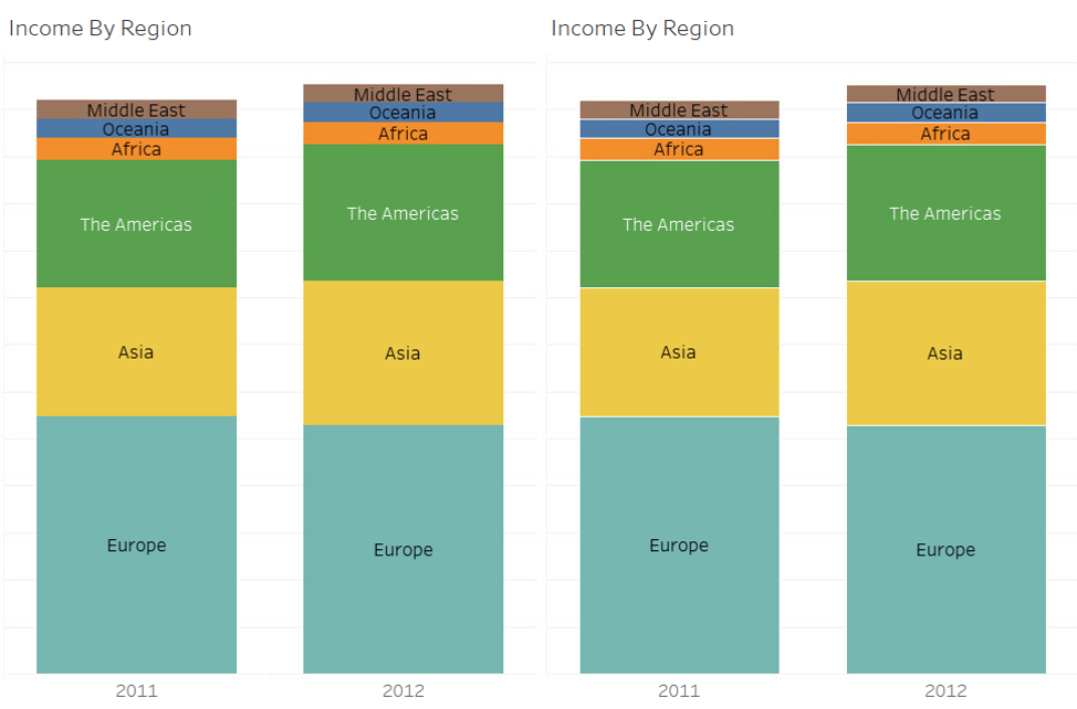
White Space
ช่องว่าง หรือ White Space สามารถช่วยให้ผู้อ่านจำแนกองค์ประกอบในกราฟได้ง่ายขึ้นและป้องกันการสับสนของสีและลวดลาย ในตัวอย่างกราฟด้านล่าง มีการใช้เส้นขาวมาแบ่งระหว่างแต่ละสีในกราฟ ซึ่งช่วยในการแยกสีต่าง ๆ ออกจากกันได้อย่างง่ายดาย ซึ่งช่วยให้กราฟของเรานั้น Accessible มากขึ้น
ใช้องค์ประกอบอื่นนอกจากสี
หากเราใช้สีเพียงอย่างเดียวในการสื่อสาร ไม่เพียงแต่คนตาบอดสีเท่านั้นที่จะเจอปัญหา หาก Visualization ถูกพิมพ์แจกจ่ายเป็นขาวดำก็จะเกิดปัญหาได้เช่นเดียวกัน
- ใช้รูปร่าง หรือ ลวดลาย ในการจำแนกองค์ประกอบนอกเหนือจากสี
- มี Legend ที่เหมาะสมที่ช่วยอธิบายการใช้สี
Interaction และ Animation
Data Visualization ในยุคนี้มักจะมาพร้อมกับการโต้ตอบ (Interaction) หรือภาพเคลื่อนไหว (Animation) อย่างไรก็ตามหากใช้อย่างไม่ระวังก็จะทำให้เกิด Accessible Barrier ได้
- Interaction ที่ใช้เมาส์ในการเล่น ควรจะสามารถเล่นได้ด้วยคีย์บอร์ดเช่นกัน
- หลีกเลี่ยงการใช้แสงสีกะพริบที่อาจจะกระตุ้นอาการของโรคลมชัก
ไม่ควรนำข้อมูลสำคัญ เช่น Label หรือ Legend มาอยู่ใน Tooltip ที่จะแสดงเฉพาะเมื่อนำเมาส์มาวาง เพราะจะเป็นปัญหาสำหรับผู้อ่านที่ใช้ Text Reader หรือ คีย์บอร์ด หรือ อุปกรณ์อย่าง Smart Phone
เนื้อหาโดย นนทวิทย์ ชีวเรืองโรจน์
ตรวจทานและปรับปรุงโดย อิสระพงศ์ เอกสินชล
แหล่งที่มา
Accessible data visualizations – UW–Madison Information Technology (wisc.edu)


Senior Project Manager & Data Scientist at Big Data Institute (Public Organization), BDI