
สถานการณ์โรคระบาด COVID-19 ในขณะนี้ยังคงต้องเฝ้าระวังกันอย่างต่อเนื่อง เมื่อทางศูนย์กลางการให้บริการข้อมูลเปิดภาครัฐ (Open Government Data) ภายใต้ชื่อ data.go.th ได้เปิดชุดข้อมูลรายงาน COVID-19 ประจำวัน ซึ่งเป็นรายงานผู้ป่วยยืนยันประจำวันจากกรมควบคุมโรค เราจะลองเอาข้อมูลชุดนี้มาสร้างเป็นแผนที่เพื่อแสดงจำนวนผู้ป่วยติดเชื้อในแต่ละจังหวัด โดยใช้เครื่องมือที่ชื่อว่า Shape Map ในโปรแกรม Power BI
ก่อนอื่นเราต้องเตรียมอุปกรณ์หลัก 3 อย่างสำหรับการสร้าง Shape Map แบบที่เราต้องการ คือ
1. ข้อมูลผู้ป่วยติดเชื้อ COVID-19
จากศูนย์กลางการให้บริการข้อมูลเปิดภาครัฐ (Open Government Data) (https://www.data.go.th/dataset/covid-19-daily) ซึ่งให้ข้อมูลทั้งในรูปแบบของ Excel File และ API ในกรณีนี้เราจะดึงข้อมูลผ่าน API เพื่อให้การอัพเดตข้อมูลสะดวกขึ้น เริ่มจากทำการสมัครเพื่อเป็นผู้ใช้งาน API ก่อนที่ https://opend.data.go.th/register_api/ หลังจากสมัครเรียบร้อยเราจะได้ User Token สำหรับเรียกใช้งาน API แล้วไปดูคู่มือการใช้งาน Data.go.th API (https://data.go.th/pages/data-go-th-api) เพื่อดูว่าต้องใช้ Header อะไรบ้างในการเชื่อมต่อ

2. พิกัดแผนที่สำหรับวาด Shape Map
เนื่องจาก Shape Map ใน Power BI ไม่มีพิกัดแผนที่ประเทศไทย แต่สามารถเพิ่มข้อมูลในส่วนนี้ได้ โดยเริ่มจากไปดาวน์โหลด Shapefiles จาก https://github.com/apisit/thailand.json/tree/master/TH_shape แล้วนำไฟล์ที่ดาวน์โหลดมาทั้งหมดไปแปลงเป็น TopoJSON เนื่องจาก Power BI รองรับเฉพาะไฟล์ TopoJSON ผ่านโปรแกรม Map Shaper (https://mapshaper.org/)
3. ข้อมูลรายชื่อจังหวัดภาษาอังกฤษ
เนื่องจากข้อมูลผู้ป่วยที่ได้จาก data.go.th ไม่มีข้อมูลจังหวัดที่เป็นภาษาอังกฤษ ซึ่งจำเป็นต้องใช้ร่วมกับ Shapefiles TopoJSON แต่สามารถเพิ่มข้อมูลในส่วนนี้ได้ โดยเริ่มจากไปดาวน์โหลดไฟล์ ThepExcel-Thailand-Tambon.xlsx จาก https://github.com/ThepExcel/download/blob/master/ThepExcel-Thailand-Tambon.xlsx แล้วทำการ Clean Data ให้เหลือเฉพาะข้อมูลที่ต้องการ ดังนี้
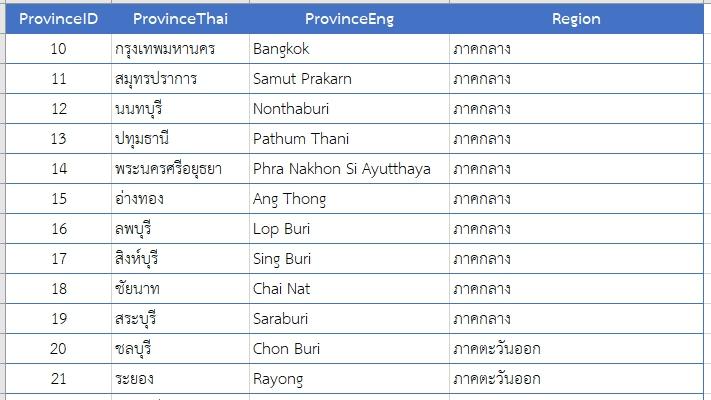
* ต้องตรวจสอบการสะกดชื่อจังหวัดภาษาอังกฤษ ให้ตรงกับ Shapefiles TopoJSON
เมื่ออุปกรณ์พร้อมแล้วก็ลงมือสร้าง Shape Map กันได้เลย
1. เปิดโปรแกรม Power BI Desktop ขึ้นมาแล้วไปที่เมนู Home > Get Data > Web จะปรากฎหน้าต่างให้ใส่ค่า URL parts ค่านี้ดูได้จาก data.go.th (https://www.data.go.th/dataset/covid-19-daily)
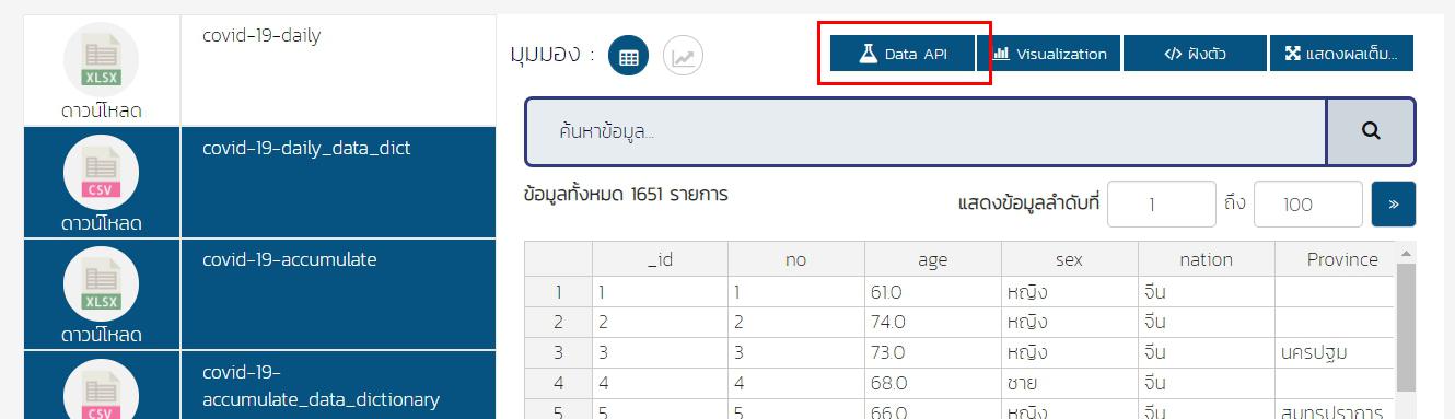
เมื่อกดปุ่ม Data API จะปรากฏหน้าต่างให้เลือกวิธีการเรียกข้อมูล ให้เลือกเป็นวิธีการเรียกข้อมูล โดยการใช้คำสั่ง SQL แบบไม่มีเงื่อนไข (ไม่มี WHERE clause)
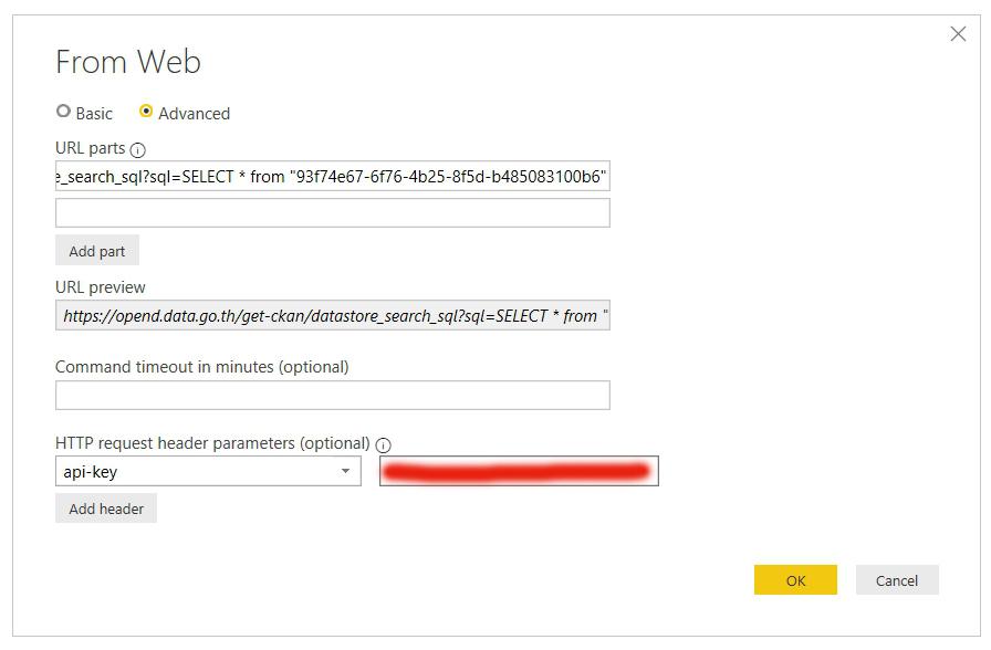
https://opend.data.go.th/get-ckan/datastore_search_sql?sql=SELECT * from "93f74e67-6f76-4b25-8f5d-b485083100b6"

คัดลอกคำสั่งมาใส่ในหน้าต่าง From Web ในส่วนของ URL parts และในส่วนของ HTTP request header parameters ให้ใส่ Header เป็น api-key ตามด้วยค่า User Token ที่ได้จากการสมัครเพื่อเป็นผู้ใช้งาน API
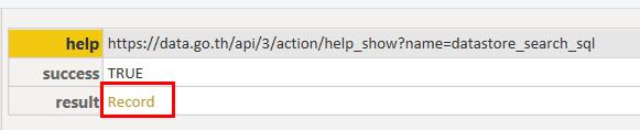
เมื่อเชื่อมต่อข้อมูลสำเร็จจะปรากฎหน้าต่างของ Power Query Editor
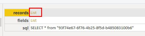
(1) คลิกเลือก Record หลังคอลัมน์ result
(2) คลิกเลือก List หลังคอลัมน์ records (หากต้องการโครงสร้างข้อมูล คลิกเลือก List หลังคอลัมน์ fields)
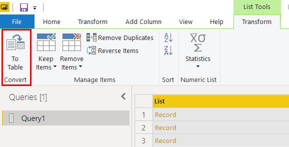
(3) คลิกเมนู Convert to Table
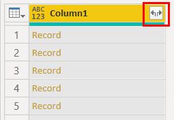
(4) คลิกปุ่ม Expand คอลัมน์
(5) จะปรากฏชุดข้อมูล (Dataset) ที่ดึงมาจาก API
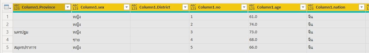
(6) จัดการ Clean Data ข้อมูลจังหวัด เสร็จแล้วคลิกเมนู Close & Apply เพื่อโหลดข้อมูลเข้าสู่ Power BI
2. โหลดข้อมูลรายชื่อจังหวัดภาษาอังกฤษเข้ามาเพิ่ม โดยไปที่เมนู เมนู Home > Get Data > Excel เลือก Sheet ที่ต้องการแล้วกดโหลด
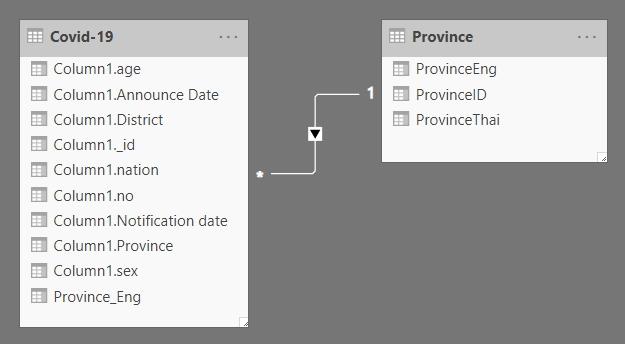
3. สร้างความสัมพันธ์ของข้อมูล คลิกเลือกมุมมอง Model > Manage Relationships > New แล้วเลือกชื่อจังหวัดภาษาไทยเป็นฟิลด์ที่แสดงความสัมพันธ์ของข้อมูล

จะได้ความสัมพันธ์ของข้อมูลเป็นดังรูป
4. คลิกเลือกมุมมอง Report > คลิกเลือก Shape Map จาก Visualizations Pane > ลากฟิลด์ ProvinceEng มาใส่ในช่อง Location > ไปที่ Format Setting > ในช่อง Shape เลือก Add map แล้วคลิกเลือก Shapefiles TopoJSON ที่เตรียมไว้ (ถ้าการสะกดชื่อจังหวัดภาษาอังกฤษ ไม่ตรงกับ Shapefiles TopoJSON จะปรากฎแถบสีไม่ครบทุกจังหวัด)
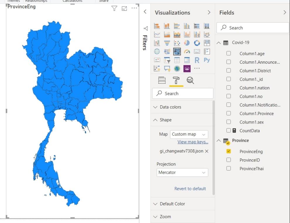
คลิกขวาที่ตาราง COVID-19 แล้วเลือก New measure เพื่อสร้างฟิลด์คำนวณจำนวนผู้ติดเชื้อ ใส่สูตรเป็น
CountData = COUNTROWS('COVID-19')
5. ลาก measure ที่สร้างขึ้นมาใส่ในช่อง Color saturation > ไปที่ Format Setting > ในช่อง Data colors เลือกปรับแต่งเฉดสีตามที่ต้องการ

6. ปรับแต่งการแสดงผลตามต้องการ ก็จะได้ Shape Map รายงานจำนวนผู้ติดเชื้อ COVID-19

Vice President, Manpower Development Division at Big Data Institute (Public Organization), BDI