
หลายๆคนคงเคยทำการวิเคราะห์ข้อมูลแต่ไม่สามารถทำ User interface หรือ UI สวย ๆ ให้ได้ใช้และเผยแพร่ผ่านทางเว็บไซต์ได้ ในวันนี้ผมจะพามารู้จักกับแพคเกจบน R studio ที่จะช่วยให้เราสามารถทำทุกอย่างได้ตามที่กล่าวมาข้างต้น นั่นก็คือ Shiny นั่นเองครับ
Shiny คืออะไร?
Shiny คือ Web application framework สำหรับ Program R ซึ่งถือว่าเป็นการเปิดโลกของชาว R people เลยทีเดียว เพราะเราสามารถเขียนคำสั่งต่าง ๆ และแสดงผลลัพธ์ได้ในลักษณะของ interactive web application หรือ แดชบอร์ด ได้ใน Program R และสามารถสั่งรันได้ทั้งบนเซิฟเวอร์ของตัวเองเช่น Digital Ocean หรือบนเว็บไซต์ Shinyapps.io
เราจะได้เรียนรู้อะไรบ้างในบทความนี้
- โครงสร้างของ Shiny web application
- ตัวอย่าง Shiny web application
- ขั้นตอนการเขียน interactive web application
โครงสร้างของ Shiny web application ประกอบด้วย 3 องค์ประกอบหลักได้แก่
1. User interface (ui)
- UI คือหน้าต่างที่คอยรับข้อมูลจากผู้ใช้งานและหน้าต่างแสดงผล
2. Server function (server)
- Server คือระบบที่ได้รับค่าจาก UI มาทำการคำนวนและส่งผลลัพธ์เพื่อไปแสดงผลบนเว็บไซต์
3. ShinyApp function (การรวมกันระหว่างองค์ประกอบที่ 1 และ 2)
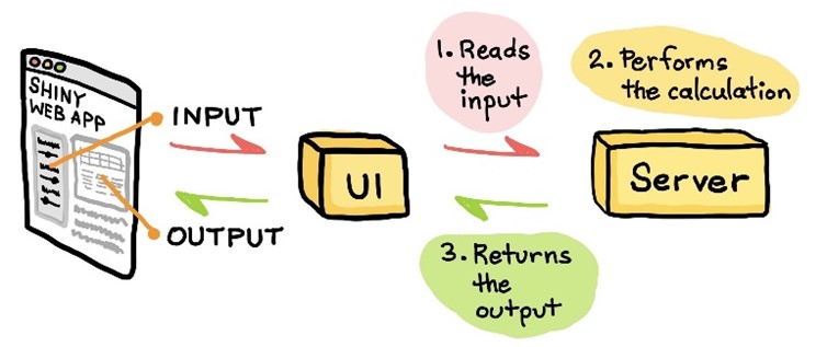
รูปที่ 1 ภาพโครงสร้างของ Shiny web application (แหล่งที่มาจาก Web Apps in R)
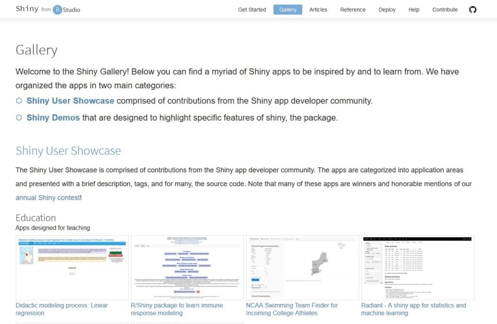
การสร้าง Web application โดยใช้ Shiny นั้นมีตัวอย่างให้ทุกคนได้ศึกษาหรือลองใช้มากมายเลยโดยเข้าได้ผ่านเว็บไซต์ Shiny gallery นี้ได้เลยครับ
เรามาชมภาพตัวอย่าง Shiny web application กันดีกว่า
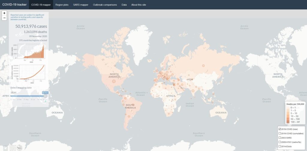
Interactive dashboard ด้านล่างเป็นการสร้าง web application ผ่าน Shiny โดยแสดงปริมาณผู้ติดเชื้อ COVID-19 ทั่วโลก ผู้สร้างคือ Dr. Edward Parker ซึ่งเปิดให้ผู้ใช้งานทั่วไปได้ใช้งานบน Shinyapps.io เพื่อน ๆ สามารถกดที่ Real time Covid-19 Tracker dashboard เพื่อเข้าไปใช้แดชบอร์ดนี้ได้เลยครับ
ตัวอย่างการเขียน interactive web application
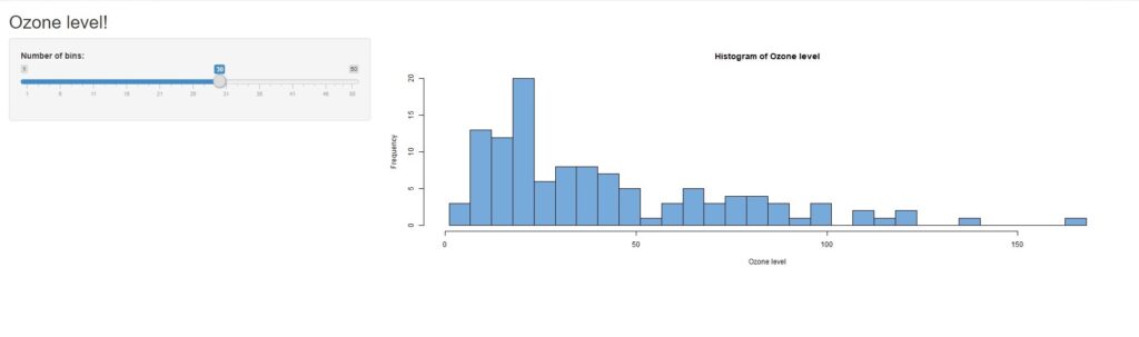
เรามาถึงช่วงที่ทุกคนจะได้สนุกกันแล้วครับ นั่นคือการเขียนคำสั่งเพื่อสร้าง Interactive web application หรือ แดชบอร์ดของตัวเอง web application แรกที่ผมจะเริ่มทำจะเป็นการสร้างกราฟการแจกแจงความถี่หรือ ฮิสโตแกรมโดยกราฟจะเปลี่ยนเมื่อผู้ใช้งานเลือกจำนวน bins หรือแท่งกราฟตามที่ต้องการ ซึ่งเพื่อน ๆ สามารถเขียนโค้ดแล้วรันไปพร้อมกันได้เลยครับ ก่อนอื่นให้สร้างไฟล์ R script ที่เราจะเขียนคำสั่งหลังจากนั้นก็เริ่มกันได้เลย
ข้อมูลที่ผมใช้จะเป็นข้อมูลที่ติดมากับโปรแกรม R อยู่แล้วครับ นั่นคือชุดข้อมูล airquality หรือข้อมูลคุณภาพของอากาศ ก่อนอื่นเราต้องนำเข้าข้อมูลรวมถึงแพคเกจที่เราจำเป็นต้องใช้กันก่อนครับ
library(shiny) # Load R packages
data(airquality)    # Load data
ถ้าผู้ใช้งานใหม่ยังไม่เคยติดตั้งแพคเกจ ให้ใช้คำสั่ง install.package(“ชื่อแพคเกจ”) ก่อนการเรียก library นะครับ
จากโครงสร้างของ Shiny web application ที่กล่าวไปข้างต้นเราต้องเริ่มจากการสร้าง User interface
ui <- fluidPage(                                   # หัวข้อแดชบอร์ด
  titlePanel("Ozone level!"),                      # Sidebar layout ประกอบด้วยการสร้างกล่อง Input และ Output ----
  sidebarLayout(                                   # Sidebar panel for inputs ----
      sidebarPanel(                              # Input: Slider สำหรับเลือกจำนวนแท่งของกราฟ ----
            sliderInput(inputId = "bins",
                  label = "Number of bins:",
                  min = 1,
                  max = 50,
                  value = 30)                      # ค่าเริ่มต้นของจำนวน bins
          ),
    mainPanel(                                     # Main panel สำหรับแสดงผลหรือ output ----
      plotOutput(outputId = "distPlot")            # Output: Histogram ----
    )
  )
)
คำสั่งข้างต้นเป็นการกำหนดหน้าตาของ web application ที่เราจะสร้าง ซึ่งหลังเครื่องหมาย # จะเป็นคำอธิบายคำสั่งในบรรทัดนั้น ๆ ครับ โดย input จะมีหน้าตาออกมาเป็น slide bar เพื่อเลือกจำนวน bins ที่เราต้องการโดยมีค่าเริ่มต้นเป็น 30 ส่วน output จะมีหน้าตาเป็นกราฟฮิสโตแกรม โดยทั้งหมดนี้จะถูกเก็บไว้ในตัวแปรที่ชื่อว่า ui ครับ
ขั้นตอนต่อไปคือการสร้าง Server function เป็นการกำหนดว่าเราจะใช้ข้อมูลอะไร คำนวนอย่างไรให้ได้ output ออกมาเป็นฮิสโตแกรมที่เราต้องการ
server <- function(input, output) {
  output$distPlot <- renderPlot({
    x    <- airquality$Ozone                               #กำหนดคอลัมน์ Ozone ใน ข้อมูล airquality เพื่อนำมาพลอต
    x    <- na.omit(x)                                   #ลบข้อมูลที่เป็น na ออก
    bins <- seq(min(x), max(x), length.out = input$bins + 1)  #เก็บค่าที่นับไว้ในตัวแปร bins
    hist(x, breaks = bins, col = "#75AADB", border = "black", #สร้างกราฟจากข้อมูลและ bins ที่กำหนดไว้ด้านบนรวมถึงการกำหนดธีมและสีของกราฟ
         xlab = "Ozone level",                                #ชื่อแกน x
         main = "Histogram of Ozone level")                   #ชื่อหัวข้อกราฟ
  })
}
คำสั่งด้านบนเป็นการเขียนฟังก์ชันคำนวนจำนวน bins และการสร้างกราฟฮิสโตแกรมและเก็บคำสั่งไว้ในตัวแปรที่ชื่อว่า server ครับ
ใกล้จะเสร็จแล้ว ขั้นตอนสุดท้ายง่ายมากเลยครับคือการนำทั้งสองขั้นตอนแรกมารวมกันเพื่อสร้าง web application คำสั่งก็จะมีแค่การนำตัวแปรทั้งสองตัวมาระบุไว้ใน shinyApp นั่นเอง โดยใช้คำสั่งด้านล่าง
shinyApp(ui = ui, server = server) เมื่อเราสั่งรันทุกอย่างแล้วนั้นทุกคนก็จะได้แดชบอร์ดแรกที่สามารถเลื่อน slide bar แล้วกราฟแท่งด้านขวาก็จะปรับเปลี่ยนไปตามจำนวน bins ที่เราเลือกได้เลยครับ
ยินดีด้วยครับทุกคน เราได้ web application แรกกันแล้ว
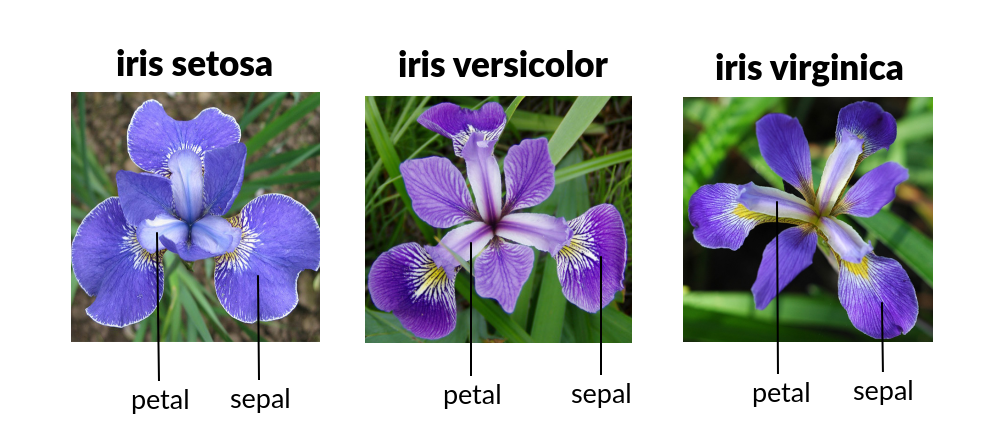
ตัวอย่างการนำโมเดลขึ้น web application
แดชบอร์ดต่อไปจะเริ่มยากขึ้นโดยการประยุกต์นำโมเดลการทำนายมาใส่ไว้ในแดชบอร์ดด้วย เพื่อน ๆ บางคนน่าจะคุ้นชินกันดีกับข้อมูล iris หรือข้อมูลพันธ์ดอกไม้ไอริสที่จะมีลักษณะทางกายภาพของดอกไม้ในแต่ละ species นั้น ๆ โดยส่วนใหญ่ข้อมูลนี้จะเป็นตัวอย่างในการสร้างโมเดลพื้นฐานสำหรับผู้ที่เริ่มต้นทำโมเดลการทำนาย แต่ในสำหรับบทความนี้ผมจะเน้นไปในเรื่องการนำโมเดลที่ทำนายแล้วขึ้นเป็น Interactive web application หรือ แดชบอร์ด
ก่อนอื่นเราต้องติดตั้งและเรียกใช้แพคเกจที่ต้องการรวมถึงข้อมูล iris
library(RCurl)  #สำหรับนำเข้าข้อมูล csv ไฟล์
library(randomForest)   #สร้างโมเดล
library(caret)
นำเข้าข้อมูล iris dataset
iris <- read.csv(text = getURL("https://raw.githubusercontent.com/dataprofessor/data/master/iris.csv"))ขั้นตอนการสร้างโมเดล
- แบ่งชุดข้อมูลเป็น 2 ส่วนคือ Train 80% และ Test 20%
TrainingIndex <- createDataPartition(iris$Species, p=0.8, list = FALSE)
TrainingSet <- iris[TrainingIndex,] # Training Set
TestingSet <- iris[-TrainingIndex,] # Test Set- Export ทั้งสองชุดข้อมูลลงเครื่อง
write.csv(TrainingSet, "training.csv")
write.csv(TestingSet, "testing.csv")- เรียกข้อมูล Train ไว้ในตัวแปรชื่อว่า TrainSet และนำหัวตารางออก
TrainSet <- read.csv("training.csv", header = TRUE,stringsAsFactors = T)
TrainSet <- TrainSet[,-1]- สร้างโมเดล Random Forest จากข้อมูล TrainSet แล้วเก็บไว้ในตัวแปรชื่อว่า model
model <- randomForest(Species ~ ., data = TrainSet, ntree = 500, mtry = 4, importance = TRUE)- บันทึกข้อมูลลงเครื่องเพื่อนำไปใช้ด้วยสกุลไฟล์ .rds
saveRDS(model, "model.rds")เมื่อเราได้ไฟล์ข้อมูลที่ถูกแบ่งและไฟล์โมเดล เราจะเอาโมเดลมานี้สร้างแดชบอร์ดกัน โดยไฟล์เหล่านี้ควรจะที่โฟลเดอร์เดียวกันกับ R script ที่ใช้ในการสร้างแดชบอร์ด
เรามาเริ่มสร้างแดชบอร์ดด้วย 3 ขั้นตอนง่าย ๆ ตามตัวอย่างแรกกันเลยครับ
ในกรณีตัวอย่างนี้ผมได้แยกคำสั่งเป็นสองไฟล์โดยการบันทึกโมเดลลงเครื่องก่อนเพื่อสามารถนำไปประยุกต์ใช้กับ web application ได้หลายเว็บเพราะฉะนั้นเราจึงต้อง import ข้อมูลและโมเดลที่เราจะใช้ก่อนการสร้าง web application ทุกครั้ง
- เรียกใช้แพคเกจต่างๆ
- นำเข้าโมเดลที่บันทึกไว้เก็บไว้ในตัวแปรชื่อว่า model
- เรียกข้อมูล Train ไว้ในตัวแปรชื่อว่า TrainSet และนำหัวตารางออก
- เริ่มคำสั่งสร้าง User interface function หรือ UI
library(shiny)
library(data.table)
model <- readRDS("model.rds")
TrainSet <- read.csv("training.csv", header = TRUE, stringsAsFactors = T)
TrainSet <- TrainSet[,-1]
ui <- pageWithSidebar(
  headerPanel('Iris Predictor'),# กำหนดชื่อแดชบอร์ด
    # สร้างแถบ input ต่าง ๆ
  sidebarPanel(
    HTML("<h3>Input parameters</h3>"),
    sliderInput("Sepal.Length", label = "Sepal Length", value = 5.0,
                min = min(TrainSet$Sepal.Length),
                max = max(TrainSet$Sepal.Length)),
    sliderInput("Sepal.Width", label = "Sepal Width", value = 3.6,
                min = min(TrainSet$Sepal.Width),
                max = max(TrainSet$Sepal.Width)),
    sliderInput("Petal.Length", label = "Petal Length", value = 1.4,
                min = min(TrainSet$Petal.Length),
                max = max(TrainSet$Petal.Length)),
    sliderInput("Petal.Width", label = "Petal Width", value = 0.2,
                min = min(TrainSet$Petal.Width),
                max = max(TrainSet$Petal.Width)),
      actionButton("submitbutton", "Submit", class = "btn btn-primary")), # สร้างปุ่ม submit
    mainPanel(# สร้างแถบแสดงผล
    tags$label(h3('Status/Output')), # Status/Output Text Box
    verbatimTextOutput('contents'),
    tableOutput('tabledata'))) #ผลการทำนาย
เช่นเดิมจากคำสั่งด้านบนจะมีคำอธิบายในแต่ละคำสั่งหลังเครื่องหมาย # นะครับ
คำสั่งการสร้าง ui ด้านบนผมได้สร้างแถบเครื่องมือเป็น slide bar รับข้อมูลของผู้ใช้งานด้วยลักษณะของดอกไม้ที่ใช้ทำนายนั่นคือ Sepal.Length, Sepal.Width, Petal.Length, Petal.Width ส่วนแถบ output ก็จะแสดงตารางซึ่งคือผลของการทำนายนั่นเอง
ขั้นตอนต่อไปเราก็มาสร้าง Server function กันเลย
server<- function(input, output) {
  datasetInput <- reactive({   #กำหนด input data ที่จะถูกป้อนเข้ามาผ่านทาง slide bar
      df <- data.frame(
      Name = c("Sepal Length",
               "Sepal Width",
               "Petal Length",
               "Petal Width"),
      Value = as.character(c(input$Sepal.Length,
                             input$Sepal.Width,
                             input$Petal.Length,
                             input$Petal.Width)),
      stringsAsFactors = FALSE)
    Species <- 0
    df <- rbind(df, Species)
    input <- transpose(df)
    write.table(input,"input.csv", sep=",", quote = FALSE, row.names = FALSE, col.names = FALSE)
    test <- read.csv(paste("input", ".csv", sep=""), header = TRUE)
    Output <- data.frame(Prediction=predict(model,test), round(predict(model,test,type="prob"), 3))     #นำข้อมูลที่ถูกป้อนเข้าโมเดลทำนาย
    print(Output)
  })

# สร้างกล่องข้อความในกรณีที่รอการป้อนข้อมูลและคำนวนเรียบร้อยแล้ว
  output$contents <- renderPrint({
    if (input$submitbutton>0) {
      isolate("Calculation complete.")
    } else {
      return("Server is ready for calculation.")
    }
  })
  # สร้างตารางผลการทำนายผ่านเงื่อนไขการกดปุ่ม submit
  output$tabledata <- renderTable({
    if (input$submitbutton>0) {
      isolate(datasetInput())
    }
  })
}
ขั้นตอนสุดท้ายง่ายสุด ๆ เลยครับ คือการรวมทั้งสองขั้นตอนเข้าด้วยกัน
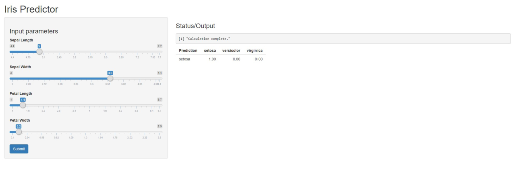
shinyApp(ui = ui, server = server)แล้วเราก็จะได้ Interactive web application ทำนายพันธุ์ดอกไม้จาก iris dataset ตามรูปภาพด้านล่างเลย
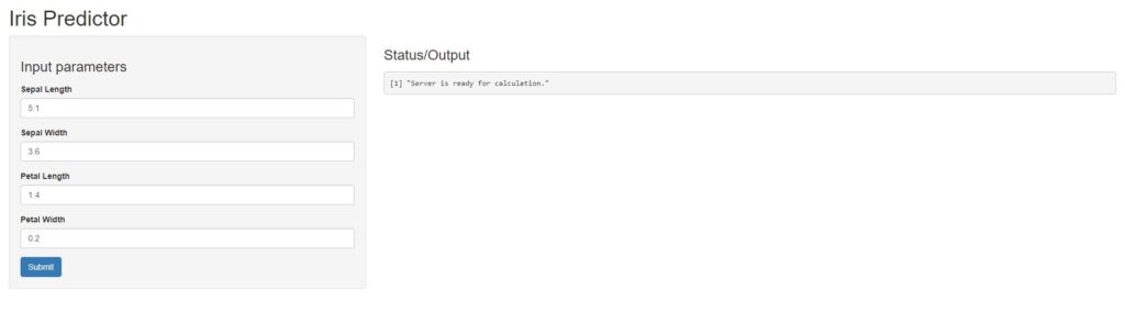
สำหรับคนที่ไม่ชอบ slide bar ในการป้อนข้อมูลก็จะมีวิธีสร้างแถบ input ด้วยการกรอกตัวเลข ง่าย ๆ เลยเราก็แก้ไขคำสั่งในการสร้าง User interface หรือ ui จาก sliderInput เป็น numericInput เท่านั้นเองครับ
ui <- pageWithSidebar(
   headerPanel('Iris Predictor'),
   sidebarPanel(
   tags$label(h3('Input parameters')),
    numericInput("Sepal.Length",
                 label = "Sepal Length",
                 value = 5.1),
    numericInput("Sepal.Width",
                 label = "Sepal Width",
                 value = 3.6),
    numericInput("Petal.Length",
                 label = "Petal Length",
                 value = 1.4),
    numericInput("Petal.Width",
                 label = "Petal Width",
                 value = 0.2),
   actionButton("submitbutton", "Submit",
                 class = "btn btn-primary")
  ), mainPanel(
    tags$label(h3('Status/Output')), # Status/Output Text Box
    verbatimTextOutput('contents'),
    tableOutput('tabledata') # Prediction results table
  ))
Web application เราก็จะออกมาเป็นการป้อนตัวเลขเข้าไปแทน slide bar แล้ว
ทั้งนี้เพื่อน ๆ สามารถนำแดชบอร์ดที่เขียนไว้สั่งรันบนเว็บไซต์ Shinyapps.io ได้โดยไปที่ลิงค์ shinyapps.io ลงทะเบียนสร้างบัญชีของตัวเองก่อนหลังจากนั้นเพื่อนๆก็จะสามารถ public แดชบอร์ดขึ้นบนว็บไซต์ได้แล้ว โดยผมจะมาบอกวิธีการให้เพื่อนๆได้ลองทำตามได้ในบทความต่อไปครับ
เป็นไงกันบ้างครับทุกคน หลาย ๆ คนที่ยังไม่คุ้นชินกับ Shiny อาจจะมึนงงกันนิดหน่อยสำหรับคนที่ไม่เคยใช้คำสั่งหรือโค้ดในการสร้างแดชบอร์ดแบบนี้เพราะในปัจจุบันก็มีเครื่องมือสำเร็จรูปในการสร้างแดชบอร์ดมากมาย
แต่สำหรับ Shiny นั้นประโยชน์ที่สำคัญเลยคือเขียนบน Program R และทุกอย่างฟรี ประหยัดงบในการที่จะต้องซื้อโปรแกรมสำเร็จรูปได้มากเลยทีเดียว รวมถึงยังมีคลังแดชบอร์ดมากมายใน Shiny gallery ให้ได้ศึกษา และสามารถใช้แพคเกจต่าง ๆ ใน Program R เข้ามาร่วมในการทำแดชบอร์ดนี้ได้อีกด้วย ซึ่งใน Shiny ยังมี package เพิ่มเติมที่ช่วยให้ Shiny มีประสิทธิภาพมากขึ้นอีกมากมายเลย เช่น shinythemes ที่จะช่วยปรับธีม สี และฟอนต์ให้แดชบอร์ดเราดูสวยงามมากขึ้น shinydashboard ที่ถูกเขียนมาเพื่อวางโครงสร้างของแดชบอร์ดให้ผู้เขียนสามารถปรับแต่งได้ง่ายมากยิ่งขึ้น และแพคเกจอย่าง shinyjs ที่ถูกพัฒนามาช่วยปรับปรุงแอพได้เหมือนภาษา JavaScript เลย
หวังว่าบทความนี้จะเป็นไอเดียที่ดีในการที่ผู้อ่านจะนำไปต่อยอดหรือสร้างสุดยอด web application ในแบบของตัวเองต่อไปครับ
ขอขอบคุณแหล่งความรู้ดี ๆ จาก Youtube Dataprofessor : https://www.youtube.com/dataprofessor